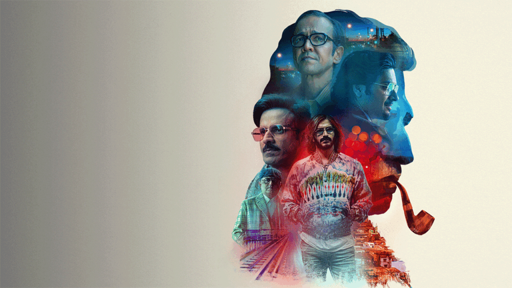
Netflix’s recent anthology series, Ray, made quite a splash in terms of its storytelling and adaptation. Starring some of the most senior actors in space, Ray is based on the short stories of Satyajit Ray.
We had an interaction with Senior Colorist Mr. Navin Shetty of Nube Studios, who put together the beautiful pallet for colour-grading three of its four stories.
Nube Cirrus, a division of Nube is the name behind some of the most prominent projects in the content space.
From the journey of determining the look and feel to adjusting the colours to suit the stories, Mr. Navin Shetty cut across all aspects of colour grading in our insightful chat.
Here are some excerpts :-
As we know Ray is based on Satyajit Ray’s stories, did you keep that in mind while designing the look for the entire series?
The directors along with DOP’s of Ray had designed specific look based on their interpretation in each of stories of Satyajit Ray and their own craft of filmmaking. For Spotlight we tried creating look of individual worlds of stars -the actor and religious guru who join hands in the end. ’forget me not’ is also a self -obsessed entrepreneur whose initial journey is an illusion of invincible success, where the look is kept bright and bold which later moves to deep and dark as story progresses. Bahrupiya is again a journey of insecure man who keeps changing his identity with disguise, hence look was adapted from somber to bright as he transforms. We had to ensure that the look and emotions are in continuation and are portrayed seamlessly throughout the flow of the story. Apart from the artist performances, we had to respect and blend in the creations of production designer and the costume designer.
You have colour-graded three stories from four, how was it working with different directors and DOP’s for the same project?
Director Srijeet Mukherjee and Vasan Bala and the DOP’s Swapnil Sona Wane, Arnab Mukherjee and Eeshit Narain have their own creative taste and style of working. All of them are genius in their own craft. As a colourist our role is to take their vision to its destination. I don’t try and impose my taste. However, I do attempt to guide the grade or opinion in a direction suited for the material and narrative and leave it on them to decide. Most of the times our intent is to maintain the integrity and the decision making and to not deviate too far from that creative intent of the storytelling, ensuring that all of them were satisfied with the output as they visualized along with overall look continuation.
Your work on Ray is being appreciated a lot, what different did you do to this project?
Satyajit Ray is one of the finest story writer and creative director Indian and international film industry has seen. The current web series is an ode and tribute to his work, his stories bring out some generic truth of human emotions which are relevant even today. Ray has three different stories directed and shot with contemporary interpretation and taste. Under culture and traditions, various color palette and treatments can be rendered, however we feel in this series through the tool of color grading, we tried our best elevate stories of individuals, put spotlight on emotional performances to influence audience to be part of the journey.
Tell us about your approach in color grading and how is the technology changing?
A film or a commercial is the director’s vision. Our role as a colorist has changed dramatically over the past two decades. Today, anyone with a computer has access to colour grading software, but the art of colour grading isn’t that simple to achieve. Just like the skill of video editing, it takes years to learn how to manipulate the software to achieve the results you want. For me, the technical aspects can only support; the creativity is the driving force. But they both feed you in a way: a new tool sometimes brings new creative ideas. And a new creative idea can open a discussion, or even just open a way to do things differently.